PRO Vietnam
Packaging Recycling Organization
In the year of 2019, rapid urbanization and consumerization combined with lack of anti litter culture and absence of recycling mindset among population is building up to a large-scale litter and ecological problem. Until now, most current narratives keep repeating about negative impact of plastic but not much of options on practical lifestyle solutions or education on habit change at grass-root level. This is where PRO Vietnam comes in.
By uniting the biggest 10 beverages companies in Vietnam for a single objective, which is to create a circular economy for packaging, and dramatically ease the impact of inorganic waste to the environment.
With luck and persevere, my pitch for this project during my time at MullenLowe Mishra come back successfully, and I was fully in charge of creating PRO Vietnam 1st brand identity, website, & manifesto film.
Role: Art Director, Graphic Designer, UX/UI Designer
Year: 2020
Client: PRO Vietnam
Agency: Mullenlowe Mishra Vietnam
Developers: PIX


The Brand Identity
As an environment friendly, recycling professional brand, PRO Vietnam board of directors has one thing set from the beginning: "The color must be Green". Other than that, it is up to my interpretation of their operation and visions to create their identity.
Digging deep into the know-how of their plans, I identify and categorize all the important aspect that makes this organization differ from all eco-friendly brands out there, because there was not much room to play with a corporation brand that is heavily communist, environment friendly, & politically driven.
Aside from being clean, trustworthy, eco-friendly, & well-designed, the logo is embed with 3 crucial gears behind PRO Vietnam operations: Their Mission, Vision & Ambition. My success in seamlessly integrating these aspect to the logo is one of the key reasons that helps it passed the brand recognition research with flying colors (Done by Kantar Vietnam):
Lettering:
The symbol itself is made by using a conceptual, unique and stylized graphic treatment of the acronym "P", "R", "O"
Circular:
The shape of the logo is a ‘Circle’ in line with vision of PRO Vietnam to contribute towards bringing about transformation in packaging recycling in Vietnam by building ‘Circular Economy’ in Vietnam
Green Target:
Colour system of Logo has been done using as 2 different shades of colour ‘Green’ to connote Sustainability and Environment, creating a visual of a green target – and this is also to match the vision of PRO Vietnam entity to make Vietnam clean, green and beautiful


The Introduction Of PRO Vietnam
Following the planned roadmap, phase 1 of PRO Vietnam is a very bold, and explosive introduction to Vietnamese citizen. What is PRO Vietnam? Are they just another eco-friendly organization that will soon disappear? Will they change Vietnam recycling habit & perspective? All the fundamental question must be addressed clearly with finesse, so that PRO Vietnam path of development could be greatly supported
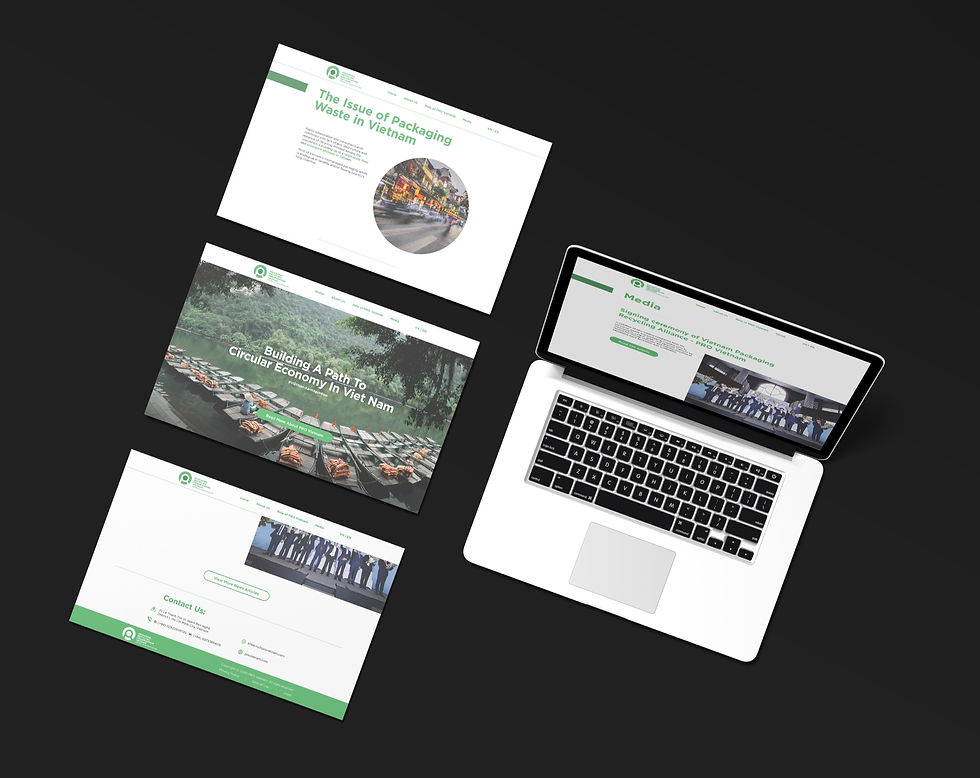
Thus, during the introduction phase, me and the team in MullenLowe Mishra Vietnam run a campaign that will launch PRO Vietnam to the Vietnamese commons, which consist of 2 key assets: The Manifesto Film & The Website. My responsibility is to create their first website as an information hub for everyone to learn more about PRO Vietnam operation and sign up to become a new member.


